 ,
,
Before you start working with photo images on your computer (or even view them), you should really make sure that your video subsystem is capable and is displaying things correctly. These pages will assist you in adjusting your monitor by providing various test patterns. They also give a brief introduction to issues involved in calibrating a monitor.
If you intend to view or manipulate photo images using the computer, you absolutely need to get video card that can support high-color mode (24 bits/pixel or higher) at a decent resolution, say 1024x768 pixels. Most of the modern video cards are capable of doing it. Higher quality (and usually more expensive) cards offer better and faster RAMDACs, which really helps, as well as extra hardware goodies, such as built-in gamma-correction, which are useful for photo imaging. Don't choose your card based on its 3D accelerator performance: that is important for computer games, but it is useless for digital imaging applications. And don't forget about monitor. This is the part of the computer you see the most. Don't skimp on it. Your eyes will thank you if you get a good one.
So, you got this latest and greatest video card and monitor combo, but the photos you see on the Net still do not look so good. What gives? Well, maybe it's because they are not so good. Check out Reference Images page if you want to see what does the quality photo scan mean. But maybe your systems requires some tuning to perform at its best. So, what do you do now?
First, make sure that your video card is running in a high color mode. If it isn't, switch the modes! Consult your system documentation to find out how to do it. You want at least 24 bits/pixel. 15 bits/pixel will do in a pinch, but don't expect great tonal gradation. Avoid 16 bits/pixel modes, they produce non-neutral grays, as one color (green) gets 1 more bit than the others. Running in lower bits/pixel modes guarantees that you will get the banding effect (smooth tonal gradations in the image appear as bands of solid color, which is painfully obvious when viewing grayscale gradients), or maybe even will force your viewing software to dither images, which looks really bad.
If you are into computer imaging, you probably already heard the term "system gamma" used. It is surrounded by obscurity and mystique and separates Those Who Know from the rest of us. So what the heck is it?
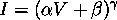
Actually it's really simple, and has to do with the way monitors work. Monitors, which are built around cathode ray tubes, have non-linear brightness response to the input signal value. Intensity I depends on input signal V as a power law
,
where exponent gamma is the same for all tubes and has value 5/2. Parameters a and b are basically set by contrast and brightness controls. Scanners (and other input sources), on the other hand, typically have linear signal response to light intensity. This poses a problem: If you scan something and then display the result on the CRT, the image will not look like the original, as midtones will be darkened. To compensate, you have to build in power-law correction somewhere between source and output with exponent that adds up to 2/5.
Displaying color image on a color CRT tube is achieved by having dots made out of three different colored phosphors (red, green, and blue - their colors are called monitor primaries). By controlling the brightness of these phosphors, dots on the screen can be made to appear to be of different colors. The moral here is that you need three values (corresponding to intensities of the three phosphors) to specify a color, as opposed to a single value needed to specify a shade in black and white images. Gamma correction needs to be applied to each color channel (but since the phosphors are meant to be well-matched, the gamma values for three channels are usually the same).
The color balance controls of the monitor (such as color temperature or separate RGB gains) adjust relative intensities of three phosphors, changing the overall color cast of the displayed image. Higher temperature setting corresponds to a bluer image, lower temperature - to a redder image. These controls are intended to match the white balance of the monitor to the workplace lighting conditions, i.e. make the white color displayed by monitor match the color of white paper placed next to it. It is essential for workplace lighting to be consistent. For best results, use daylight-balanced light sources.
The trouble is that nobody seems to agree on a single way of doing things. Even for gamma correction alone, there is a multitude of choices: PC people bravely ignore the issue and leave correction to software (system gamma 2.5), Mac crowd is proud to have partial correction implemented in hardware (system gamma 1.8), while some systems go for full correction in hardware (anyone remembers NeXT?). Video standards for historical reasons expects system gamma 2.2, and Kodak Photo CD sides with video on the issue. Add to this the fact that phosphors from different manufacturers are different, so what is red on one monitor, won't necessarily be the same shade of red on another... The whole mess is further complicated by the fact that other output devices, like printers and such, are all different, have non-linear responses, and could even be achieving color in entirely different way from CRT tube. It's a small wonder anything is working at all!
So what's a poor photographer to do? The salvation lies with the Color Management System, a piece of software designed to convert color between representations required for various devices. Knowing your hardware characteristics is half-way to having a working solution. On the most basic level, for monitor it means knowing primaries and gamma. Can you do anything if you don't have any measuring equipment? Yes, you can! While you cannot do anything about monitor primaries (so don't worry about them at this stage), there is a simple way to estimate the gamma of your system. Once you know your system gamma, you can apply appropriate gamma correction in software whenever you want to transfer files to systems with other gamma. To avoid unnecessary hassles, you might consider setting your system gamma to whatever value everyone else is using around you. Most high end video cards feature programmable hardware gamma correction. You just have to figure out how to talk to yours. You might want to check Fixing Gamma page for guidance.
OK, here are some pretty color targets to relieve your pain :). Feeling better now? Then check out Gamma Correction Home Page. Their explanation of gamma is much more verbose, and you might find it easier to digest...
Now it's time to adjust your monitor. All these buttons and dials on it actually do something, they are not there just to impress the consumers :). Below are some suggestions on what to do with them. If you know what you are doing, just ignore my ramblings and look at the test patterns. I made them to help me adjust my own monitor, but perhaps they will help you too.
The first thing you should do after your monitor syncs to the new video mode is to adjust position and size of the image on the screen. You can do it either the easy way, using the monitor controls, or the hard way, reprogramming the timer chip of your video card. (If you are unfortunate enough to run one of those so-called "user-friendly" OSes, the later is not an option. It's already been decided that you are too dumb to talk to your own hardware. No use protesting now...) Personally, I would not use monitor controls for extreme adjustments. Let the video card do its work, and set timing parameters right for your monitor.
After the size and the position of the image are roughly set, you should check if there are any geometric distortions, and get rid of them if they are present. It's often impossible to eliminate geometric distortions completely over the entire image area, no matter how hard you try. You fix one thing and the other one goes wrong. Very frustrating. This is partly the reason I like to fiddle with timing signals instead of position controls. It seems that geometric distortions are much easier to control if the timing is agreeable with your monitor.
After you sorted out geometrical controls, you should set black and white points for you monitor. This is just a fancy way of saying that you should adjust brightness and contrast to ensure that the shadows do not block and the highlights are not burnt out. Pretty straightforward thing, but often forgotten. You might be surprised how much better images will look after you do it.
You might also wish to set overall color balance of your monitor at this time. Color temperature of 5400K is what the daylight is balanced at, so that's what you should set you monitor color control to. Other commonly used setting is 6500K. Some monitors default to much cooler color rendition (9000K and up), which I dislike as it tires my eyes quickly.
At this point, it is appropriate to profile your display using whatever means you have available (from subjective guesstimate to densitometer reading), as it is described elsewhere on this site. Once you have adjusted the controls to your satisfaction and profiled the display, do not touch the controls unless you want to recalibrate your monitor from scratch again. People sometimes even tape them over to remind other users on shared machines that they should not mess with the settings.
By now images should start looking good on your screen, but there is still some fine tuning that can be done. Scout your monitor controls (and documentation) for more advanced things that can be adjusted, like convergence and moire. But don't overdo things and try to fix something that isn't broke. Factory defaults are usually sane for these esoteric controls.
[ Back to Scarse Project Homepage ]